
The Internet's Design Problem
How ads and web design make terrible aesthetics

Hello Internet, Matt, here. In today’s post, I’ll take a deep dive into a video that I saw earlier today from a forum I am a part of. It is genuinely up my alley.
Said post is about ads and how they are ruining the aesthetics of websites that don’t otherwise need them. There were also comments made about how the aesthetics are messed up. Feast your eyes on this video from Kai Lentit on YouTube.
Figure 1: Kai Lentit video about ads and design in cooking sites.
The Internet is just a place for ad dispersion.
In all honesty, people (even me) talk about ads online like they are an absolute evil, a sin straight from Hell. Maybe they are, but probably not all that much. Ads, in their most basic form are just small images or text to capture your attention and drive the attention to the person in question. Ads are really not that bad with that frame of reference.
They are a distraction, a time sink and (if you feel so inclined) an eyesore. That they are, if you’re thinking about it on a very surface level.
When you look at it a little bit deeper, though, the ads on the internet look a bit more sinister. Do you ever notice that ads seem to follow you around? Ads did this fir Kai once or twice during this video. They can do this via a strategy called retargeting. This happens when ad networks know where you are through the website cookies that you accept and add those to the algorithms on their ads on other sites. The ads from the old site are more likely to shoe up because they win attention bids on the demand side auctions that take place seconds before you see the ads.
Another way ads get in the way of properly experiencing the internet is by literally getting in your way. At many points in his video, the ads were barriers from him seeing the sites properly. They are also a bigger distraction than other ads. Popup ads are such a big distraction that you are more likely to click them since they are the only thing in view for several seconds. You most likely have to click them to get back into the flow of your browsing; if you click them wring, you’re in for a rude awakening from another site.
Modern web design
It is no secret that modern web design is dependent on flashy graphics, lots of movement, and somehow, some way, lots of negative space. This can be both bad and good. For instance, in the context of the Substack writing page, lots of negative white space is fine. As you see in the figure below, the white space is fairly evenly distributed; the text blocks are flush center of the page.
Figure 1: The Substack article writing page.
On the other hand, the modern desktop site is a tossup between having something like the Substack writing interface, a boring social media interface or some weird left/right justify boxes like the ones shown in figure 2.
Figure 2: A typical 2025 search engine.
The platforms lumped in to the above categories are not wrong for picking one format over the others. Some formats work better than others. What I’m saying is that some formats look better than others. First and foremost, centered pages present information more comfortably. This is doubly so for wider screens. This is because you don’t have to look too far in any direction to view the content you’re looking at. Centered text, itself, may appear odd sometimes, but centered elements do not. Look at Reddit, for an example of this.
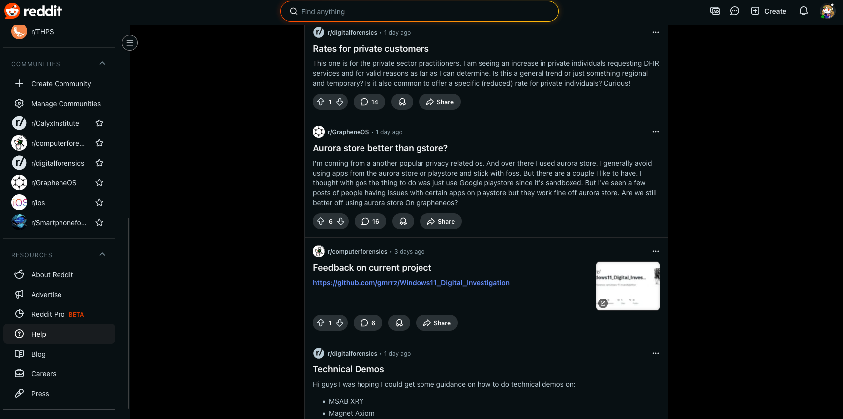
Figure 3: Reddit User-interface shows how (relatively) centered elements are comfortable to read and understand.
As you can see with Reddit, the main thing you are looking at in the page is your posts. They are in focus in the center of the page. You can focus on the top if you want to search something and on the left side if you want to interact with anything else. This is good design in general. Combined with the fact that it’s an infinite scroll, this design makes the site a great deal for retention.
Circling back to the search engine, in its most basic form, it is very good at what it’s made for: showing information. On the design side, however, I argue that it is a bit clunky. First off, you must glance in a direction other than center to look in the direction of your information. Secondly, it’s not necessarily easy to filter the search results to make them better for you with easy controls. For example, on DuckDuckGo, the search engine he and I both use, the search results have a three dot menu that pulls out options to rank the search results as helpful or not. This is not eh best choice. I’d prefer more obvious voting mechanics.
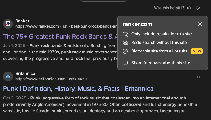
Figure 4: DDG voting mechanics.
Finally, if you’re very unlucky, your search engine will begin the results you are given with ads and an AI helper. While the AI helper is annoying, it can be helpful if you just want quick results and don’t want to read a million random blogs to find your answer. The AI helpers may also give wrong answers, so be aware of that.
Finally, we have the regular pages that everyone visits. The ones laden with ads, social media buttons, and colorful images. Again, I’m not advocating for pages that are glorified online books with infinite scrolls, I am simply saying that the design of some pages is not very friendly to the eyes. Looking back into the video, all of the chow mein recipe sites show this in spades. Their designs are so filled with extra things that it distracts from the experience of reading a site. There are many ads and they all get in the way of the experience.
The attention economy is crazy.
The Size

Figure 5: Don’t ask me where this Trump came from. It’s funny, so I used it.
Modern sites are big and inefficient. This is what I can gather from the commentary and some of the things seen on screen. It is crazy to think that a web site could have as many ads as one that he showed has and still be under 6 MB of size. That being said, it is sad that some sites are small and still so inefficient.
This size and inefficiency comes from the sheer size of the HTML/CSS/JS codebases that the the sites use. These codebases account for all of the functions of the site, including its cookies, its ads, and the way it’s displayed for the user. I can’t say something for every site, but I can make a blanket statement. I can say that it feels very unnecessary for a developer to integrate ads into their sites at the cost of user experience, size and efficiency. I’d much prefer a fast site with no ads than a slow one with many ads.
Conclusion
With all of my points made, I’d like to say that this was a good video and had some fun humor to it too. I would recommend you to watch it. It is fun and I enjoyed it.
I hope you enjoyed this article. If you did, make sure to like, share and subscribe. Extra points and perks for becoming a paid subscriber.